The CaFÉ team regularly releases new features, improvements, and fixes for the site. In the previous two months, we released fixes to the confirmation deadline, resolved an error that was occurring at checkout, and updated the images on the CaFÉ website to feature more artwork from CaFÉ artists. We also released several enhancements to the design and functionality of the jury scorecard pages that will improve the workflow and ease of access for jurors.
New CaFÉ Fixes and Features for Artists
New Images Release on CaFÉ Website
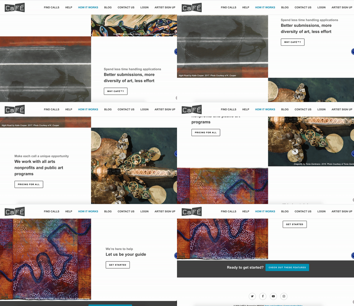
The CaFÉ website has some new art! In June, we refreshed the images on our website to feature even more artwork submitted by CaFÉ artists to our Way Out West call for entries. You can see the new images throughout our website, callforentry.org, and be sure to check out our Instagram page to see even more amazing work by these talented artists.
Updated Confirmation Deadline to 11:59 p.m. Mountain Time
We’ve fixed an error on our Confirmation Deadline field for calls that require invited artists to accept or reject their invitation. Previously, the deadline was set to 12:01 a.m. Mountain Time on the chosen deadline day. This has now been updated to match the deadline time used for applications, which occurs at 11:59 p.m. Mountain Time on the chosen date.
Resolved Double Entry Fee Purchase Error
We resolved an issue that allowed artists to purchase two entry fees at once if two entry fees of $0.00 were set up by the call administrator. Artists will now only be able to check out a single entry fee.
New CaFÉ Fixes and Features for Jurors
We’ve released several improvements to the user interface and functionality of the jury landing page and scorecards. The redesign will help jurors see images and application information more clearly, while the new functionality will allow jurors to more easily sort applications, save their scores, and view form answers. These updates were implemented on all three scorecard views: Monitor, Projection, and Gallery. Below is the overview of the changes made to each scorecard view.
Monitor Jury Landing Page Improvements
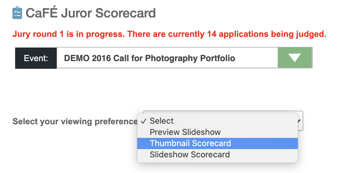
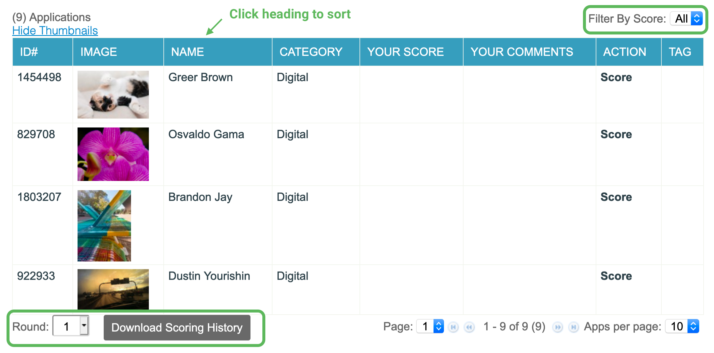
If the call administrator chooses the Monitor Scorecard View for their jury, the jurors will see a number of updates to the landing page. First, the options for jurors to select their viewing preferences are now placed in a drop-down menu. Once the viewing preference is selected, the table with the number of scored and unscored entries will appear.
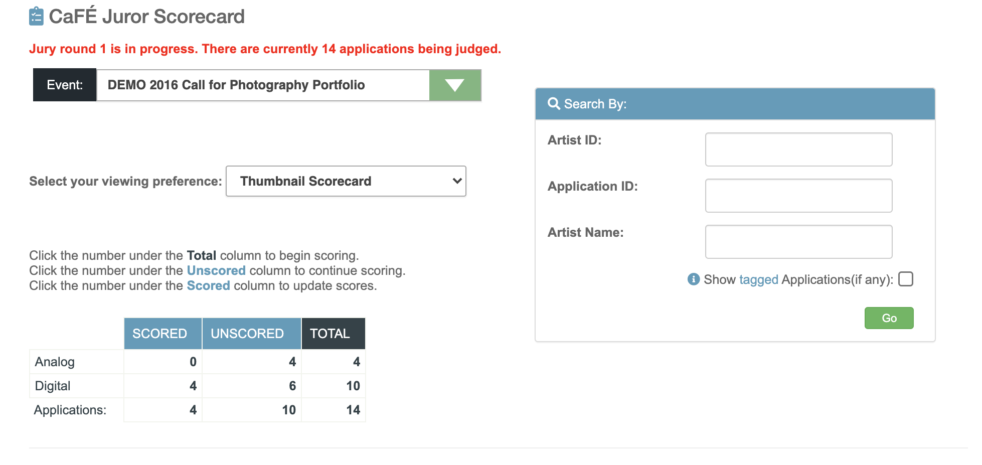
Second, we changed the name of “Remaining” entries to “Unscored” to better represent those applications. Third, the search box has been moved to the side to allow for easier access. When the number of applications to be scored is clicked, the scorecard will appear in a pop-up window and the table of applications will appear on the landing page.
Another update we made allows jurors to click any of the headings on this table to sort the columns in ascending or descending order. Finally, we added a function that allows jurors to download their scores and comments from any jury round.
Monitor Scorecard Improvements
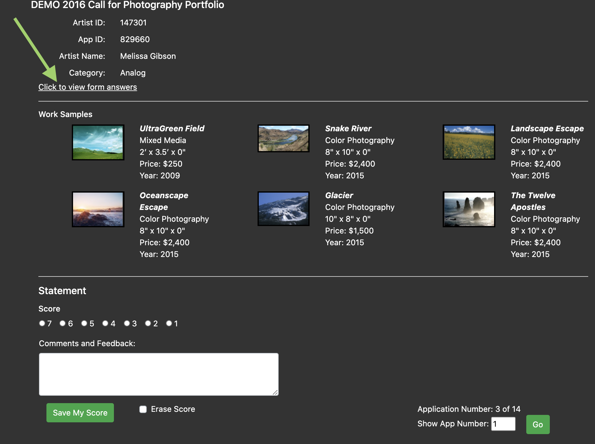
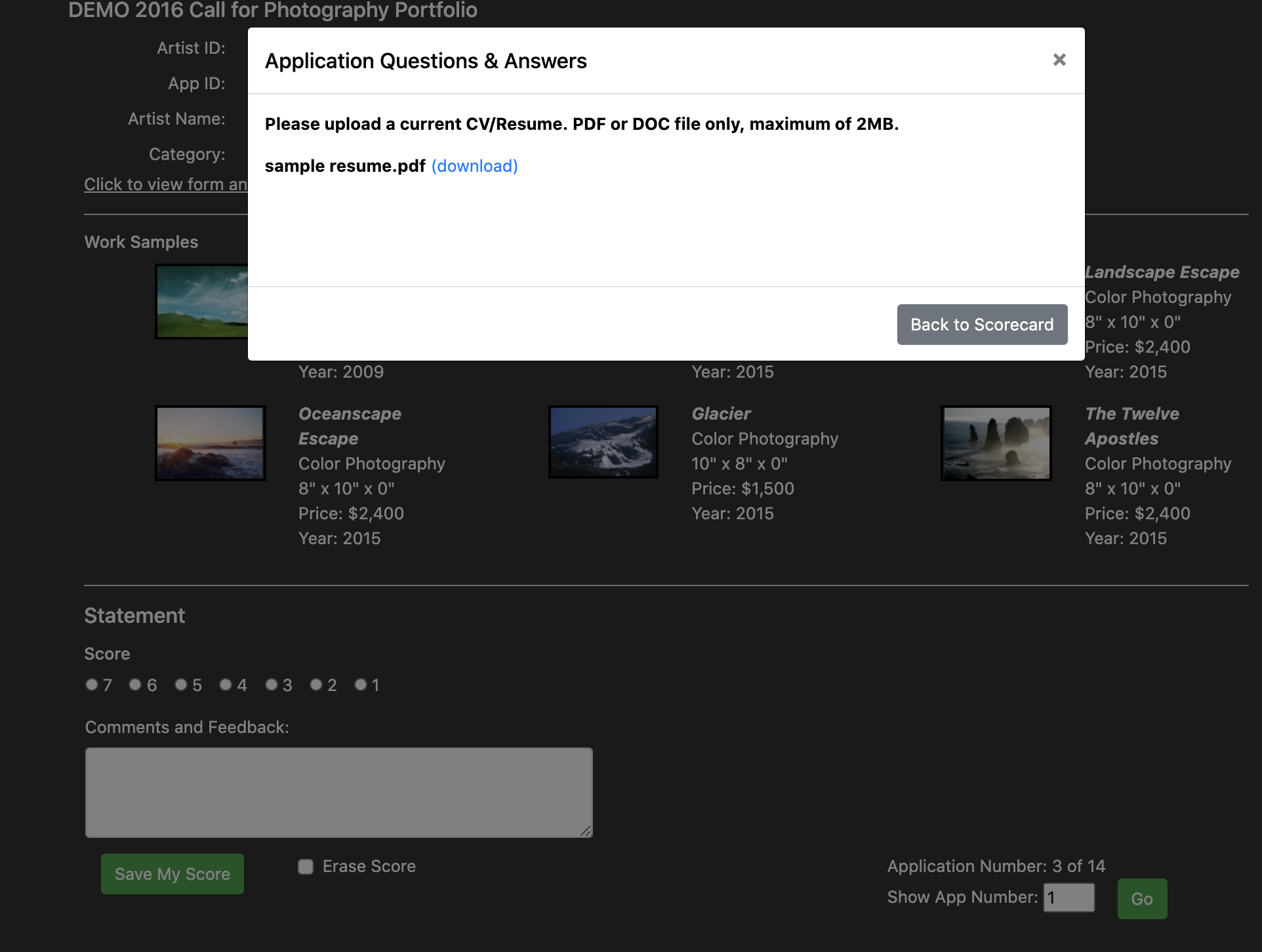
The scorecard page appears as a pop-up window when the juror selects the number of entries to be scored. This scorecard has a number of design and functionality changes. First, the background color of the scorecard has been changed from black to gray so the scorecard is easier on the eyes and allows the text and image thumbnails to stand out. Second, the scorecard is split into three key areas: Application Information, Work Samples, and Statement to improve the juror’s workflow. Third, when a juror selects Click to view form answers, instead of being directed to a new page, a modal now opens, which allows the juror to stay on the same page. Finally, the arrows that are used to move between images while they are enlarged are more clearly placed on the left and right side of the images for easier viewing.
Projection Jury Landing Page Improvements
The changes made to the Projection Scorecard View landing page are the same as those made to the Monitor Scorecard View landing page. The search box has been moved, the table of applications is now sortable by clicking the heading, and “Remaining” entries are now called “Unscored” entries. Jurors are also able to download scores and comments from any round of review.
Projection Scorecard Improvements
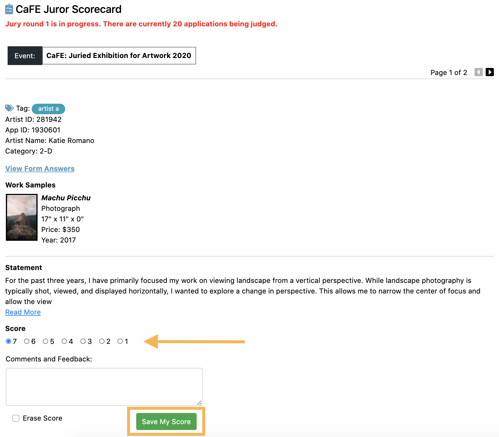
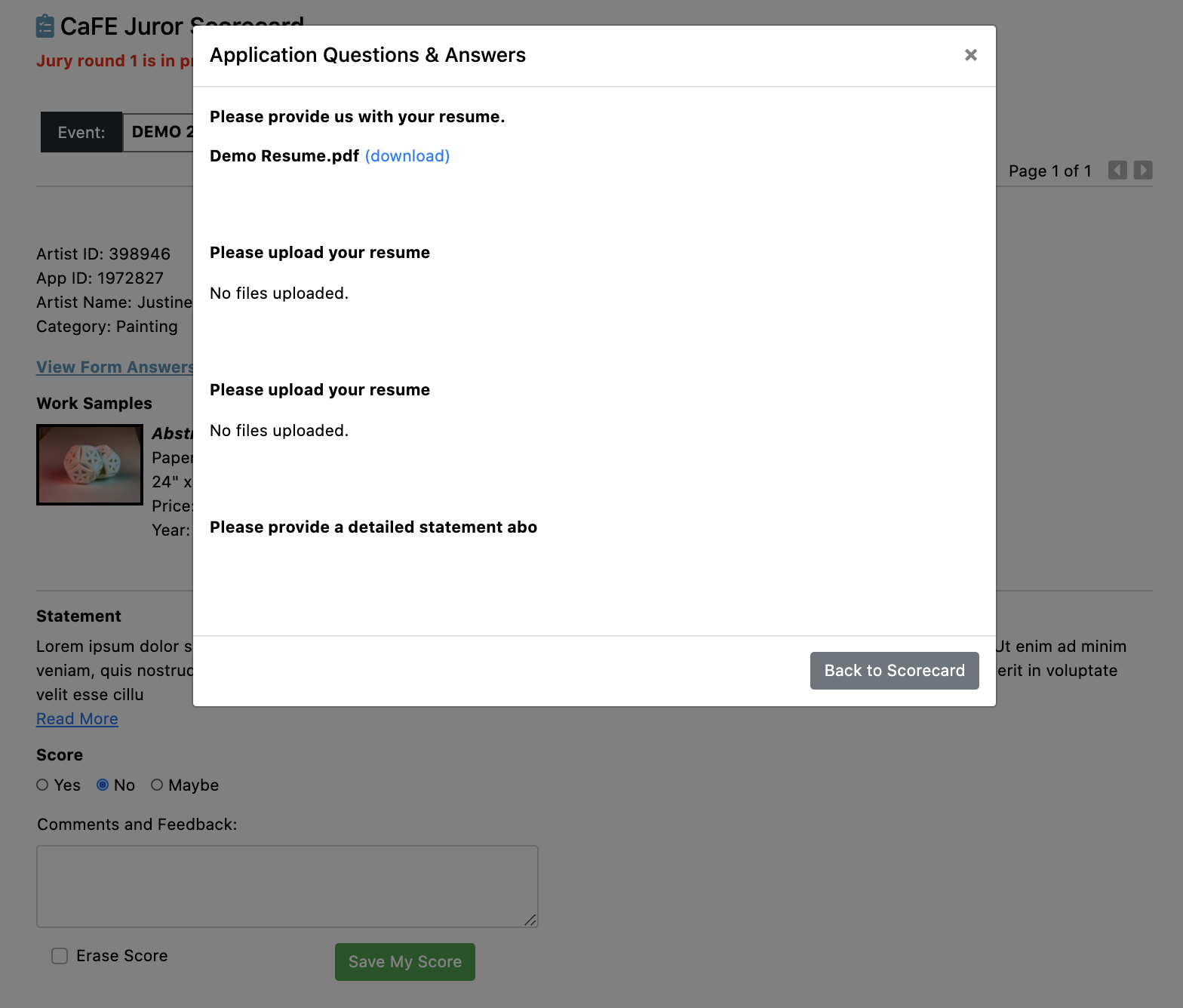
We’ve updated the scorecard for the Projection Scorecard View to improve the functionality of the juror’s workflow. First, the scorecard now opens in a new window so the juror may refer to the landing page if needed. Second, there is now a Save My Score button at the bottom of every scorecard, as opposed to only one Save button at the bottom of the page. When the Save My Score button is clicked, the page automatically scrolls to the next application. This ensures the jurors’ scores are saved properly. Additionally, when the juror clicks View Form Answers, a modal will open, as opposed to a new page, allowing them to stay on the same page as the scorecard.
Gallery Jury Landing Page and Scorecard Improvements
We’ve made similar improvements to the landing page of the Gallery Scorecard View. Just as in Monitor and Projection views, the search box is aligned on the right side for easier access and “Remaining” entries have been renamed “Unscored.” When the juror clicks on the number of entries to be scored, the scorecard appears on the landing page just as it did previously; however, it now appears on a white background with gray icons. The jurors will now also see the filter and sort options at the top of the page, instead of the bottom. Jurors may also download the scoring history from any jury round at the bottom of this page.
Written by Communications Coordinator Justine Chapel


